Resume Margins, Fonts, and Spacing Guide
Master the technical aspects of resume formatting to create a professional, recruiter-friendly document that passes ATS screening.
Free ATS Check: Upload your resume to instantly see if your formatting will pass Applicant Tracking Systems. Get started for free
Quick Answer
For a professional, ATS-friendly resume, use these formatting guidelines:
Margins
0.5-1 inch on all sides, with 1 inch as the standard professional setting for most industries.
Fonts
Use sans-serif fonts like Arial, Calibri, or Helvetica at 10-12pt for body text and 12-16pt for headings.
Spacing
Use 1.0-1.15 line spacing, 6-8pt between bullet points, and 14-20pt between major sections.
Important: Consistent formatting throughout your resume is critical. Inconsistent margins, fonts, or spacing create a disorganized impression and can negatively impact ATS screening.
Free ATS Check: Sign up for a free account and get immediate feedback on your resume's ATS compatibility. Our system analyzes your formatting and provides actionable recommendations to ensure your resume gets past automated screening systems.
Resume Formatting Elements
Understanding the key formatting elements that impact your resume's effectiveness
Margins
The white space around the edges of your resume
Affects readability, content density, and overall visual balance
Recommendation:
0.5-1 inch on all sides (may vary based on content volume)
Fonts
The typeface used for your resume text
Determines readability, professionalism, and personality
Recommendation:
Sans-serif fonts like Arial, Calibri, or Helvetica at 10-12pt size
Line Spacing
The vertical space between lines of text
Affects readability and content density
Recommendation:
1.0-1.15 for body text, 1.15-1.5 before new sections
Paragraph Spacing
The space between paragraphs or bullet points
Creates visual separation between distinct ideas
Recommendation:
6-10pt spacing between bullet points, 10-14pt between sections
Text Alignment
How text is aligned on the page
Affects readability and professional appearance
Recommendation:
Left-aligned body text, possibly center-aligned headers
Section Breaks
Visual separation between resume sections
Organizes information and improves scannability
Recommendation:
Clear headings, horizontal lines, or extra spacing
White Space
Empty space that provides visual breathing room
Makes content less overwhelming and more appealing
Recommendation:
Balanced distribution throughout the resume
Resume Margin Settings
Choose the right margin preset based on your resume content and career situation
Standard Balance
Balanced margins that work for most resumes
Top
1 inch
Bottom
1 inch
Left
1 inch
Right
1 inch
Best For:
- Most resume types
- Single-page resumes
- Traditional industries
- Applicants with moderate content
Avoid If:
- When you have extensive content to fit
- Very creative positions
Content Maximizer
Slightly narrower margins to fit more content
Top
0.7 inch
Bottom
0.7 inch
Left
0.75 inch
Right
0.75 inch
Best For:
- Experienced professionals with lots of relevant experience
- Technical resumes with many skills to list
- Two-page resumes that need to be condensed
Avoid If:
- Entry-level positions with limited content
- When content appears cramped
- When readability suffers
Modern Asymmetric
Wider left margin with narrower top/right/bottom
Top
0.8 inch
Bottom
0.8 inch
Left
1.25 inch
Right
0.75 inch
Best For:
- Creative industry positions
- Modern companies and startups
- Design-focused roles
- Resumes with a two-column layout
Avoid If:
- Traditional industries (law, finance, medicine)
- Academic CV formats
- When applying to conservative organizations
Executive Presence
Wider margins all around for an executive look
Top
1.25 inch
Bottom
1.25 inch
Left
1.25 inch
Right
1.25 inch
Best For:
- Executive and C-level positions
- Minimal, high-impact resumes
- When quality is valued over quantity
- Positions where polish and presentation matter most
Avoid If:
- Entry and mid-level positions with lots to showcase
- Technical roles requiring extensive skill listings
- When you need to fit a lot of information on one page
The Print Test
Before finalizing your resume margins, print out a physical copy to verify how it looks on paper. What appears perfectly fine on screen might look different when printed, especially if you're using non-standard margin settings.
Pro Tip: If submitting both electronic and printed versions, ensure your resume looks good in both formats by testing with standard 1-inch margins.
Resume Font Recommendations
Professional, readable fonts that work well for both ATS systems and human reviewers
Calibri
Excellent all-purpose font that's clean, modern and highly readable
Fallbacks: Arial, Helvetica
Arial
Classic, neutral font that works well in most industries
Fallbacks: Helvetica, Verdana
Helvetica
Professional, clean font ideal for modern resumes
Fallbacks: Arial, Univers
Garamond
Elegant font good for traditional industries and academic positions
Fallbacks: Georgia, Times New Roman
Georgia
Professional serif font with excellent readability on screens
Fallbacks: Times New Roman, Palatino
Lato
Modern, friendly font that works well in progressive industries
Fallbacks: Roboto, Open Sans
Verdana
Highly readable on screens, good for digital distribution
Fallbacks: Tahoma, Arial
Trebuchet MS
Distinctive but professional font good for standing out slightly
Fallbacks: Lucida Grande, Arial
Font Size Guidelines
- Body text: 10-12pt (11pt is ideal for most resumes)
- Section headings: 12-16pt (14pt is standard)
- Your name: 16-22pt (as the most prominent element)
- Contact information: 10-11pt (slightly smaller than body text)
Fonts to Avoid
- Comic Sans, Papyrus, Brush Script: Too casual and unprofessional
- Impact, Broadway, Stencil: Too bold and difficult to read in paragraphs
- Courier, Courier New: Dated and takes up excessive space
- Uncommon or custom fonts: May not display correctly when opened on another computer
Resume Spacing Guidelines
Create clear visual hierarchy and improve readability with proper spacing
Between section headings and content
8-12pt space
Creates clear visual separation between headings and the content that follows
Between different resume sections
14-20pt space
Clearly separates major sections for easy visual scanning
Between bullet points
6-8pt space
Provides enough separation for distinction without excessive gaps
Line spacing within paragraphs
1.0-1.15 line spacing
Balances readability with the need to conserve space
Between job entries
10-14pt space
Distinguishes between different jobs while maintaining section cohesion
After page break (for multi-page resumes)
Equal top margin as first page
Maintains consistent appearance across all pages
Between columns (for multi-column layouts)
0.3-0.5 inches
Provides clear separation between columns without excessive gaps
Consistency is Key
No matter which spacing values you choose, maintain consistent spacing for similar elements throughout your resume. This creates a clean, professional appearance and helps recruiters quickly scan your document.
Pro Tip: Create a "spacing system" where section headings, job entries, and bullet points each have their own consistent spacing values. This creates an invisible visual rhythm that guides the reader through your resume.
ATS Compatibility Considerations
Ensure your formatting passes Applicant Tracking Systems to reach human reviewers
What is an ATS?
Applicant Tracking Systems (ATS) are software used by employers to collect, scan, and rank job applications. These systems often struggle with complex formatting, unusual fonts, and non-standard layouts. Following proper formatting guidelines ensures your resume gets through the ATS and into the hands of hiring managers.
Free ATS Checker: Not sure if your resume will pass ATS screening? Our free ATS compatibility checker analyzes your resume's formatting and provides detailed feedback on how to improve its chances of getting past automated systems. Try it for free
ATS-Friendly Formatting Guidelines
Margins
Stay within standard margins (0.5-1 inch)
Extreme margin settings can cause text to be missed or incorrectly parsed by ATS systems
Fonts
Stick with common fonts (Arial, Calibri, Times New Roman)
Unusual fonts may not render properly in ATS systems, causing parsing errors
Text Size
Keep text between 10-12pt for body text
Very small text can be missed by OCR technology in ATS systems
Line Spacing
Use standard line spacing (1.0-1.15)
Unusual spacing can confuse ATS parsing algorithms
Special Characters
Avoid unusual bullets, symbols, and special characters
Special characters often get translated incorrectly by ATS systems
Section Breaks
Use standard section headers like 'Experience' and 'Education'
ATS systems are programmed to recognize common section titles
Text Boxes and Tables
Avoid text boxes, tables, headers/footers, and multi-column layouts
These formatting elements often break during ATS parsing, causing your information to be lost
Common Resume Formatting Mistakes
Avoid these errors that can undermine your resume's effectiveness
Inconsistent spacing throughout the resume
Inconsistent spacing creates a disorganized, unprofessional appearance that distracts recruiters
Solution: Use consistent spacing values for similar elements across your entire resume
Margins that are too narrow (<0.5 inch)
Extremely narrow margins make your resume look cramped and difficult to read
Solution: Keep margins at least 0.5 inch, preferably 0.75-1 inch on all sides
Using multiple font types (more than 2)
Too many fonts create a chaotic, unprofessional appearance that's hard to follow
Solution: Stick to 1-2 fonts maximum (one for headings, one for body text)
Font size too small (under 10pt)
Tiny text is difficult to read and may be automatically rejected by ATS systems
Solution: Keep body text between 10-12pt and headings between 12-16pt
Excessive bold, italic, or underlined text
Over-formatting defeats the purpose of emphasis and creates visual noise
Solution: Use emphasis formatting sparingly and consistently for important information only
No clear visual hierarchy
Without visual hierarchy, recruiters can't quickly scan and find important information
Solution: Create distinct heading styles and consistent spacing to establish clear hierarchy
Cramming too much information with minimal spacing
Overly dense resumes overwhelm reviewers and are likely to be skipped entirely
Solution: Be selective with content and maintain adequate spacing, even if it means a second page
Expert Formatting Tips
Advice from hiring professionals on resume formatting that stands out
Michael NaoNao
Senior Recruiter, Tech Industry
"For technical resumes, consider using a slightly condensed font like Arial Narrow for skills sections to maximize space while maintaining readability."
Jennifer Williams
HR Director with 12+ years experience
"Before submitting your resume, print it out to check the margins and spacing. What looks good on screen might appear differently on paper, which is still how many hiring managers review resumes."
David Waterburg
Corporate Recruiter, Fortune 500 Companies
"If you're struggling with space, adjust the line spacing slightly (to 1.0) before reducing font size or margins. This subtle change preserves readability while fitting more content."
The 6-Second Test
Recruiters typically spend just 6-10 seconds scanning a resume initially. Proper formatting creates visual cues that guide their eyes to your most important qualifications during this crucial first scan.
Pro Tip: Ask someone to look at your resume for just 6 seconds, then close it and tell you what they remember. This will help you identify if your formatting is effectively highlighting your key selling points.
Industry-Specific Formatting Considerations
Adapt your resume formatting to meet industry expectations
Traditional Industries
Finance, Law, Medicine, Government, Corporate
Standard 1-inch margins all around
Conservative fonts like Times New Roman, Garamond, or Arial
11-12pt font size for body text
Minimal formatting, with clear section headers
Single-column layout with logical progression
Minimal or no color, with black text on white background
Creative Industries
Design, Marketing, Advertising, Media, Arts
More flexibility with margins (0.5-1 inch)
Modern sans-serif fonts like Helvetica, Calibri, or Lato
Can use two-column layouts for better visual interest
Subtle color for section headings and accents
More white space to create visual appeal
Can include tasteful icons or graphic elements
Tech Industries
Software Development, IT, Data Science, Engineering
Balanced margins (0.75-1 inch) for readability
Clean sans-serif fonts like Arial, Calibri, or Verdana
Clear, organized sections for technologies and skills
Strategic use of bolding for technologies and languages
Consistent formatting for project descriptions
Organized, scannable lists of technical competencies
Executive Level
C-Suite, Directors, Senior Management
Generous margins (1-1.25 inch) for executive presence
Sophisticated fonts like Garamond, Georgia, or Cambria
11-12pt font size for optimal readability
Ample white space to convey importance
Strategic use of bolding for achievements and results
Elegant, minimal design that emphasizes executive presence
Frequently Asked Questions
Should I use a one-inch margin on all sides of my resume?
One-inch margins are the standard recommendation and work well for most resumes. However, you can adjust margins slightly (never below 0.5 inch) if you need more space for content. If you have limited content, stick with one-inch margins for a balanced, professional look. Whatever margins you choose, ensure they're consistent on all pages.
What's the best font and size for a resume?
The best fonts for resumes are clean, professional, and highly readable. Sans-serif fonts like Arial, Calibri, and Helvetica are excellent choices for most industries. Font size should generally be 10-12pt for body text, with 11pt being an ideal balance between readability and space efficiency. Headings can be 12-16pt, and your name at the top can be larger (16-22pt) to create visual hierarchy.
How much line spacing should I use on my resume?
For body text and bullet points, use line spacing between 1.0-1.15 to balance readability with space efficiency. Increase spacing slightly (to 1.15-1.5) before new sections to create visual separation. The goal is to create sufficient white space for easy reading without wasting too much space. If you're struggling to fit content on your resume, adjusting line spacing is often better than reducing font size or margins.
Is it okay to use color in my resume formatting?
Limited, strategic use of color can enhance your resume's visual appeal, particularly in creative fields. However, keep colors subtle and professional (navy blue, dark green, burgundy) and use them consistently for section headings or dividing lines. For traditional industries like finance, law, or medicine, it's safer to stick with black text on a white background. Always ensure your resume looks professional when printed in black and white, as many recruiters still print resumes.
Should I use a single-column or two-column resume layout?
Single-column layouts are the most ATS-friendly and work well for most industries. They provide a clear reading path and are ideal for chronological resumes. Two-column layouts can be visually appealing and efficient for space, making them good for creative fields or when you need to fit more information on one page. If you use a two-column layout, ensure the left column is wider than the right and that related information stays together to maintain logical flow.
Professional Resume Templates with Perfect Formatting
All our templates are professionally designed with optimal margins, fonts, and spacing for maximum ATS compatibility and visual appeal
Nobel Template

Perfect for executives and professionals seeking a sophisticated, balanced layout with optimal spacing.
Minimalt Template
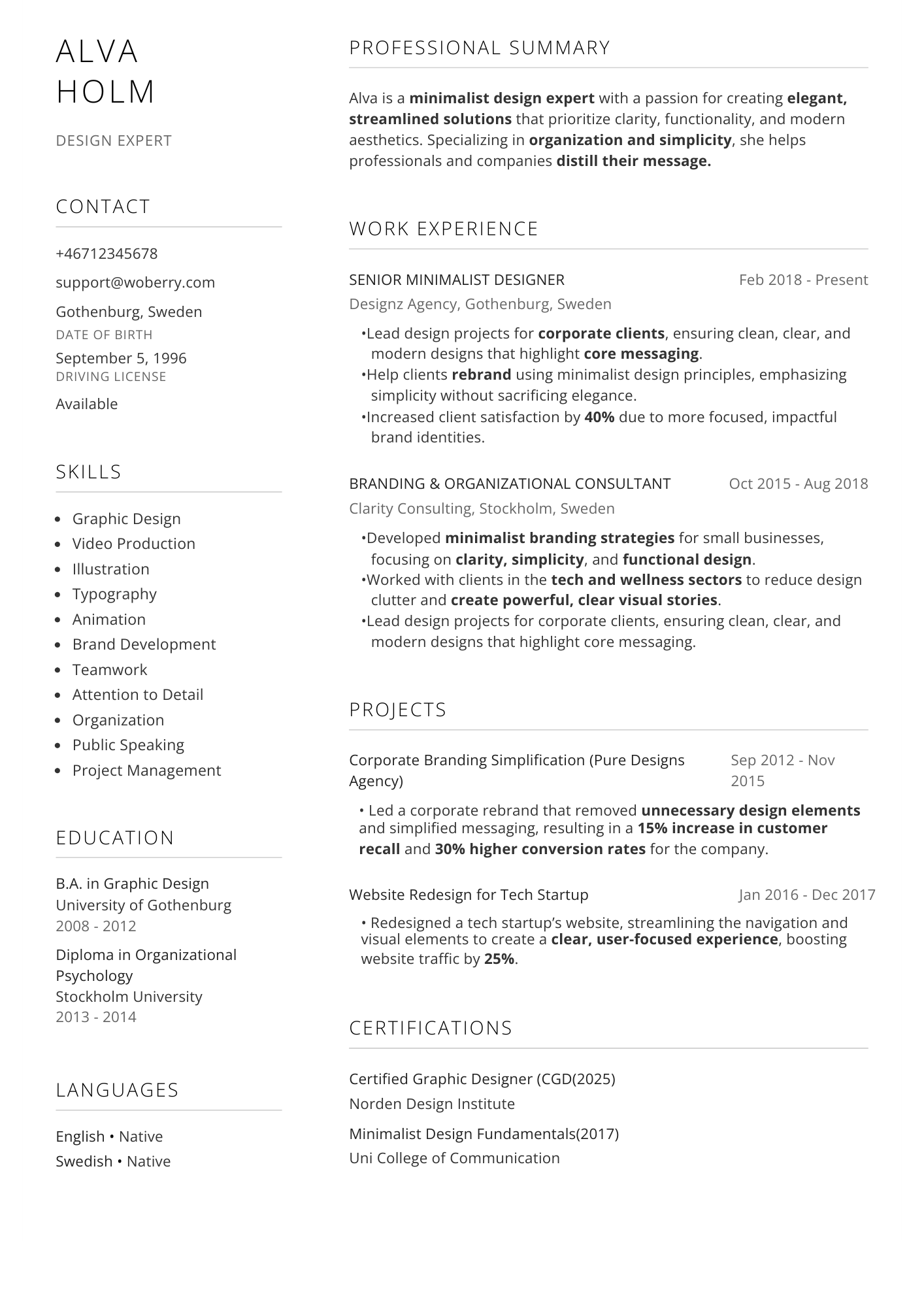
Clean two-column design with perfect margins and spacing that strips away excess, highlighting what matters most.
Resultat Template
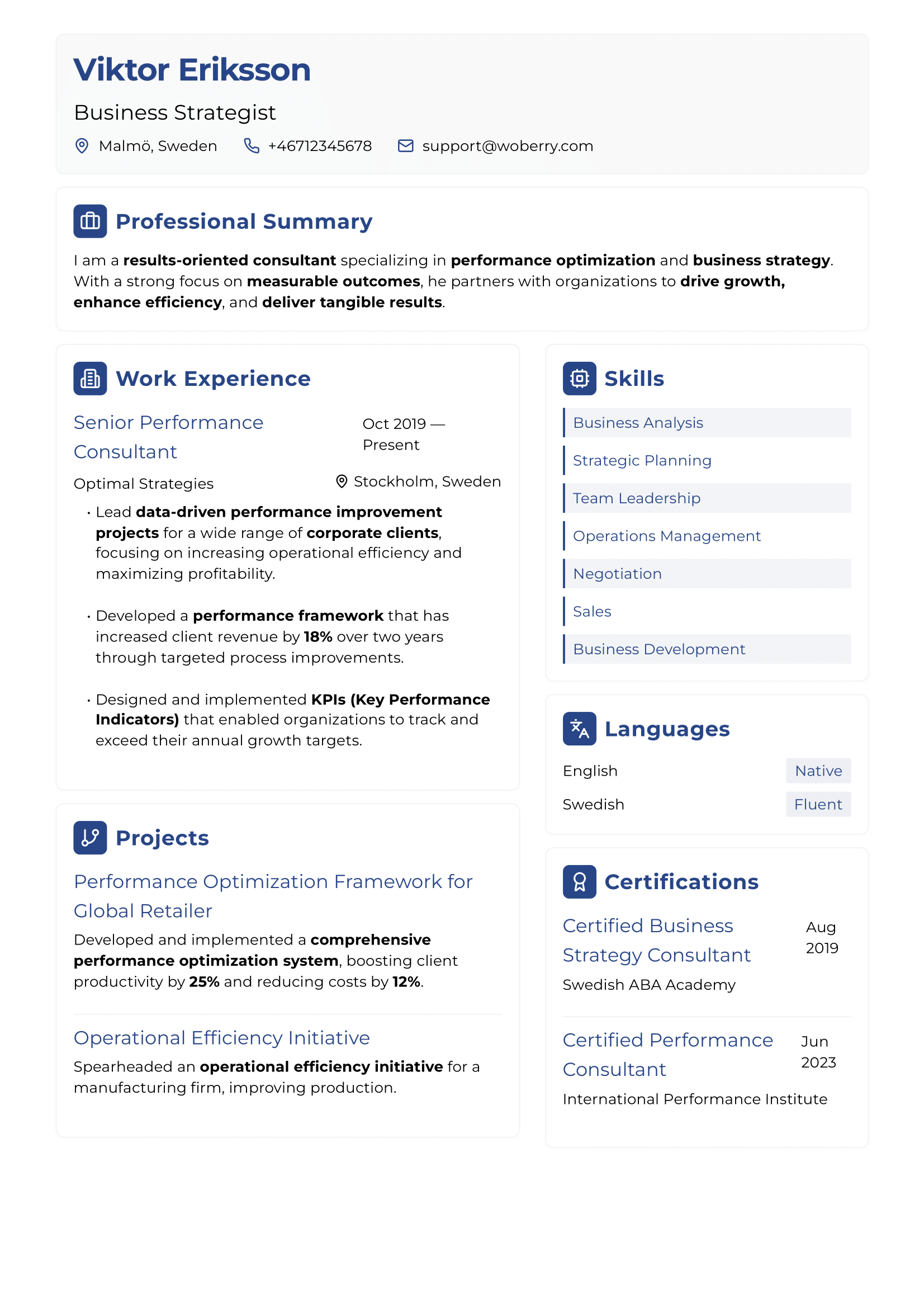
Results-focused template with optimized formatting for achievement-oriented professionals who want to showcase outcomes.
Will Your Resume Pass the ATS Test?
75% of resumes are rejected by ATS systems before a human ever sees them. Poor formatting is a leading cause of these rejections.
Analyze your resume's ATS compatibility score in seconds
Get specific formatting recommendations to improve ATS readability
Identify issues with margins, fonts, spacing, and complex formatting
ATS Compatibility Check
Margin Optimization
85%Font Compatibility
92%Spacing Efficiency
68%Section Organization
78%Overall ATS Score
81%Issue detected: Line spacing is slightly below optimal range in the work experience section. Click "View Details" for specific recommendations.